During the summer of 2016 I volunteered with the Digital Curation Innovation Center on their International Research Portal project. I created a logo for them and revamped the search design on their site. In addition, I developed user testing protocols to test the design.
Update: It’s live: http://irp2.ehri-project.eu/
The IRP2 is the University of Maryland’s Digital Curation Innovation Center’s partnership with 18 different institutions holding records pertaining to lost art from World War 2. The goal is to provide users with a federated database where they can perform their research on one site but cover multiple platforms.
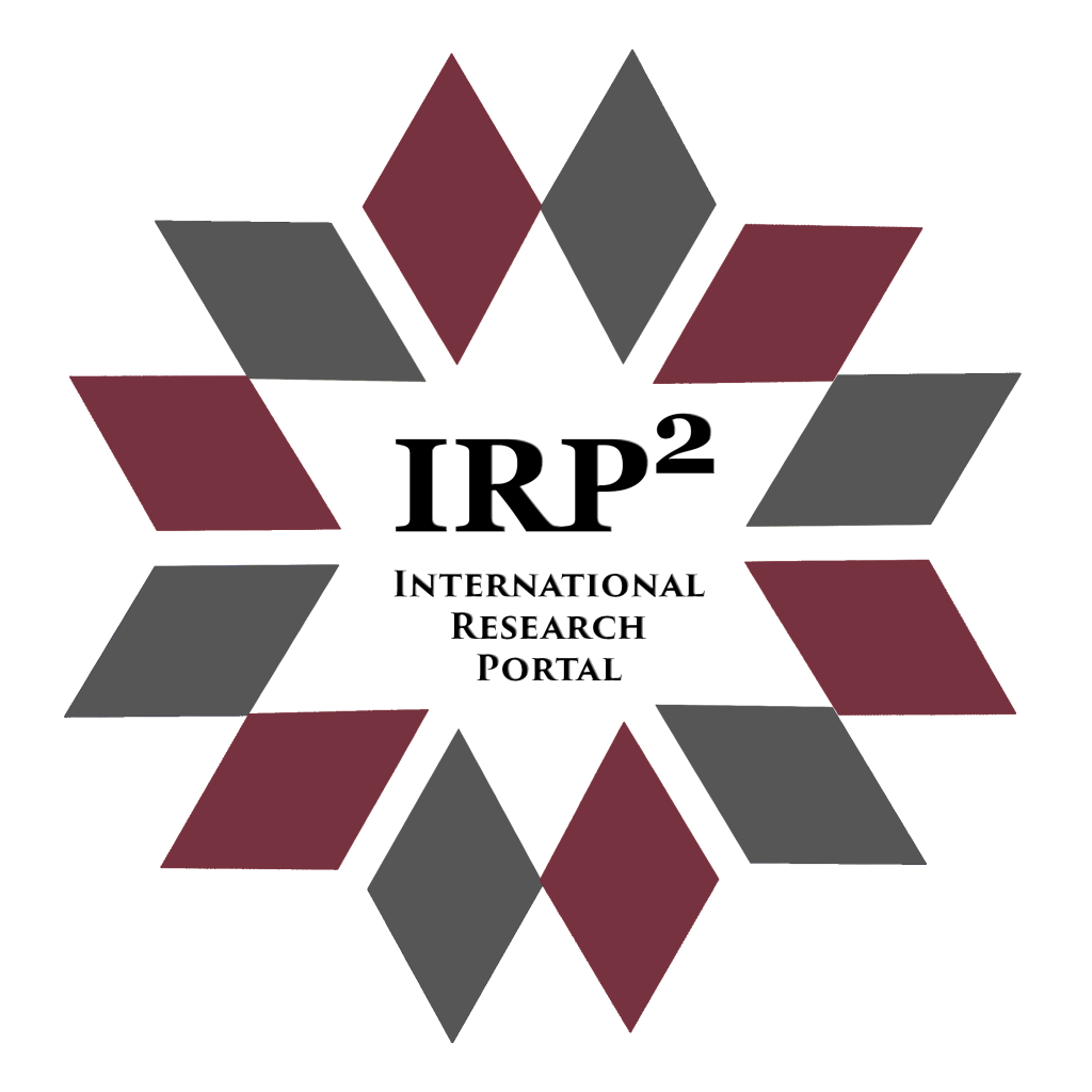
One of the tasks during my summer with the International Research Portal (IRP2), was to develop a logo. This was a challenge not only because of how many organizations were involved in the committee, but also because of the sensitivity to issues surrounding the Holocaust.

Was the selected Logo at the end. Some other prototypes I liked (but for either design or practical reasons were not selected) were:


The end logo is actually a refined version of the initial logo, which was designed to have consistency (but slight distinction) with the National Archives’ Logo (a five point star with the geometric add-ons off of it).

Many refinements in the design were done between the first rendition and the final. A big one was to choose colors that were not associated with any one country. We didn’t want any country to feel excluded, but it would have been too busy to have enough colors in to represent everyone. The Star of David was a design choice we debated over, but I quickly found taking away the outlines gave it more visual appeal and less political tones.
My favorite concept, which never made it past initial idea prototyping because of practical issues of scalability was the art over time. Since many of the art works in the database spanned the lifetime of human existence. The concept starts with cave art, and ends at a visual representation of digitization.

Many other projects were taken on that summer, but many have less visual appeal, so will be covered briefly. Materials for them can be provided upon further questioning.
The team I worked with in Summer of 2016 consisted of 3 members, since most students were not in town during the summer.

The original project I had accepted the internship for was to create a visual database of ERR cards to assist with tracking down lost artwork. These cards were records compiled first by German soldiers as they seized assets, and then by American soldiers as they attempted to restore assets.
For political reasons, we were not able to obtain the digital copies of these records from Fold3. The records couldn’t be obtained by datamining either because the site NARA gave them to to digitalize is very JavaScript heavy, and buggy. Even when obtained at a small scale, would not display relevant part on any of the OCR software.
So instead, I was placed on many smaller projects, such as giving the site a visual makeover, working with Karishma to create a way for users to save their search results to come back to later, and developing a User Testing protocol.
Technologies utilized were Jinga2, Python and Vagrant.
Here is a before and after of the search page, the buttons were redesigned for consistency as well as usability by an older population (from observation, many of our initial users were past middle age)

The email results button wasn’t even the same shape as the other buttons. Also the advance search filters were AFTER the search button.

Other pages we worked on were:


The saved search feature was designed to create the instances in an environment they can be moved and manipulated around the screen by the user in order of importance.
Unfortunately the User Testing Phase occurred after my internship was completed, but many components were developed for the test, that can be used interchangeably according to the preferences of the tester and time restraints.

Leave a comment