Exploring the inequity of funding received through the New York Federal Stimulus using Tableau.
Duration: 2 weeks
Methods Employed: Data Visualization (Tableau), Quantitative Data Analysis
For one of our two week projects in Visual Analytics, we were to analysis a data set using Tableau. I used the New York City Federal Stimulus data provided by Dr. Elmqvist.
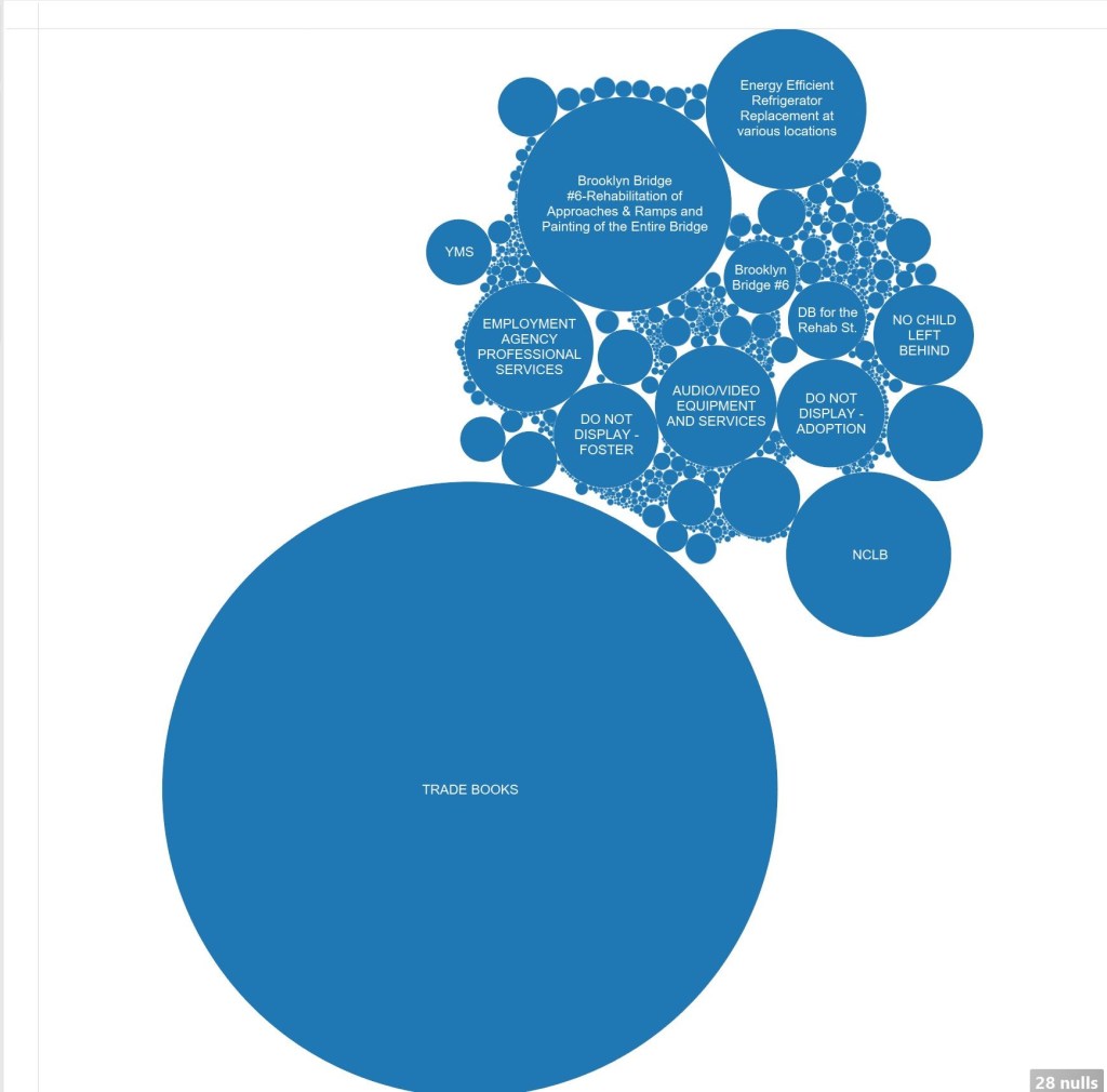
In this dataset the inequity of funding is quite apparent, The Department of Education received a great deal of money that wasn’t always put to immediate use. The notorious No Child Left Behind had only spent about 0.10% of their large amount of funding, where as other areas of need were actually utilizing their funding, while receiving a great deal less.
For this dataset both the amount, the contracted companies, and how much of the money was used are examined. Fortunately New York City has plenty of provisions for ensuring an education to all public school students, even those with special needs. The effectiveness of that investment could not be determined from this dataset, and additional studies would need to be completed to figure out which investments had the most payoff for the New York City residents.
One of the more unusual areas nearly 8 billion dollars was spent on was replacing old refrigerators with energy efficient ones. More data on this is presented below, as well as information on the large amount of money being spent on restoration of the Brooklyn Bridge.
A project I found really neat that benefitted from the stimulus funding was the Identity Theft Unit established at DANY in 2009. There wasn’t much noteworthy about this in the dataset other than the fact they had already spent 22.49% of their funding at the time of this dataset.
Many of the funds were announced in mid-2009 and awarded shortly after, many of the May 2009 awards were distributed in June, where as many of the September awards were awarded the same month.


As can be seen in the chart above, one of the major areas of spending with the federal stimulus was with the department of education. With the department of transportation and NYCHA as distant second and third place for spending.


Trade books was by far the largest contract from the dataset, and their largest funding source is for Special Education. They received part of their funding from Title 1 educational grants as well.

The Brooklyn Bridge Rehabilitation project has received quite a bit more funding than any other project from the Department of transportation. But what stands out is that each of the contractors on that project received the exact same amount, whether they were painting contractors or engineers.


A few million dollars were spent supporting low income housing through Tax Credit Assistance, with much more contracted out for the future.

P.C. Richards & Co., working with NYCHA, was a major contractor for the Public Housing Capital Fund Recovery Grant. They supplied low income housing with Energy Efficient Refrigerators with a contract value of over 7.58 Billion Dollars. This was funding entirely through the Stimulus.

Roofing seems to be a cost effective and relatively quickly completed, investment in New York City. One aspect that stood out was that even the projects that were 50% or more completed had generally spent less than 10% of the funds, with only 60% estimated to be spent before the deadline.
Unfortunately, not being a New York City Resident, with this data set I am not able to determine how effective this stimulus was. Only which projects have been mostly completed (unfortunately not many at the time this data set was published) and how much of the funding has been spent before their deadlines. Tableau seemed to be a relatively effective tool for this type of data, as it was easy to spot the extreme areas in this dataset, and it combined a lot of related data together for generalization purposes.
One weakness of Tableau that appeared when analyzing this dataset, was that Tableau groups related data for display. While this makes it an incredibly effective tool, it also made it difficult to spot outliers or particular spots at a micro scale, but was incredibly effective at looking at general data trends. But as you can see from the above screen shots, there were quite a few times I had to look at the underlying dataset for more information.

Leave a comment