This image was generated during the analysis of a 60 GB text file of social network data from Yelp. Analysis was completed using Gephi, Anaconda, R Studio and Trifecta Data Wrangler.
Duration: 2 weeks
Methods Employed: Data Cleaning, Data Visualization (Gephi), Anaconda, R Studio, Qualitative Analysis, Quantitative Analysis

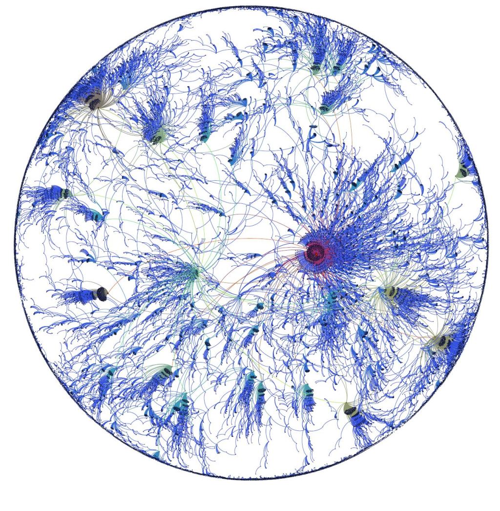
Users of note are depicted in colors other than blue. The two most important nodes, for different statistical reasons discussed later, are the red node and the green node to the left of it.
The data for this study was downloaded from the 2016 Yelp Dataset Challenge. The dataset included the user data used in this study, as well as information about the restaurants, reviews themselves, and images. The original format of this data was a JSON file. The information about the user included the user id, name, review count, average stars, number of useful, cool or funny votes, whether or not the user was voted an elite Yelp user, and their number of fans.
Almost half of the users in the dataset didn’t have friends in this social network. For purposes of this study having the intention of creating a social network graph, we only used users with 1 or more friends for the preliminary data set. Trifacta Wrangler was utilized to transition the JSON file to a CSV spreadsheet. EmEditor was utilized for text and dataset analysis involving searches, as well as for massive but straight forward formatting edits. Python and Excel were used to organize statistics about the data. One issue that was run into was that some of the friend’s lists were larger than Python’s ability to handle arrays. The largest set of array values Python was able to handle was 1257, because of this an imperfect method to estimate friend count was used. A feature in Microsoft Excel to count the number of times a User ID occurred within the listed friends’ lists was utilized, but that only counted the number of friends within the dataset, not the number of friends total.
The graph was created in Gephi by keeping only users who had 2 degrees of centrality in the imported data set. As can be seen not all users included maintained those connections once the less connected nodes were removed.
The graph is made up of 36,487 nodes representing the users with the highest degree centrality in the network. There are 36,809 edges yielding a density of 2.76 x 10⁻⁵. The diameter is 10, and the average path length is 2.38. The blue nodes represent those with lower degree connections, and red nodes are the highest. Anything with a yellow hue falls somewhere in between those two extremes on the graph.
Yelp has some rather atypical qualities from a social networking standpoint. There is very little incentive to make an account unless you plan to write reviews. Most of the site’s features and information can be accessed without the user even needing to create an account. Unlike Amazon’s review network, users aren’t required to sign in to buy things, since it is directing them towards a brick and mortar store. Additionally, there aren’t features to share with friends, such as wish lists or registries, in the manner possible on Amazon. There is not a strong reason to sign into your account unless you had a really polarizing experience at a restaurant, or are aiming for the perks of “Elite” status.
Furthermore, given the fact that of the user’s in the data set, nearly half didn’t use the friend feature at all, Yelp seems to function much differently than other popular social networks. This is likely due to the fact that the content user’s share on Yelp is related to critiquing businesses. More than likely, the most common use of Yelp is to try and find somewhere to eat that is well regarded, close in proximity and within the user’s preferences.
Through follow up research, I discovered that almost all of the users who were most closely tied into this social network hailed from California. Many of them have been designated Elite members in recent years. Another feature they had in common was their prolific use of photos on their profile and in their reviews. Based on their photos, they all seemed to be relatively young, most likely in their 20s or 30s. Additionally, all of them but Russel shared a blog link on their Yelp profile. In fact, Jeremy and Russel both users who had a fairly central location in the graphs, turned out to be the CEOs of Yelp!
California users being the central users was an incredibly surprising finding, given the fact the US cities the dataset covered was listed on the Yelp Dataset Challenge site as covering: Pittsburgh, Charlotte, Urbana-Champaign, Phoenix, Las Vegas, and Madison. This does explain an obstacle I ran into when labeling the graph for analysis. While the prominent users discussed in this study had enough sheer information about them, they were possible to look up, some of their connections situated at interesting points in a graph didn’t. This baffled me until I looked up the prominent users on Yelp and realized their geographical location.
A limiting feature of this dataset is the dearth of personal details for the users of this data set. Again, this can be ascribed to Yelp being an atypical social network. But more connections and data could be gleaned with more information, even demographic information. On the site itself information is given about the users’ location, and many active users share profile or review pictures from which the rest can be discerned. But even having the geographical information in the User’s JSON object would have been immensely helpful for deriving more insights from this data.
These had to be obtained through searching the Yelp site. The Yelp site lets you search for users by name and by geographical region, making it very difficult to find anyone. Users were found through finding the restaurant page from a review they wrote, and sorting by dates. The Yelp site has much more support for finding businesses than they do for finding users.

Leave a comment