I consulted with meteorologists to create a way for them to more quickly compare the data they received from weather balloons. This work was accepted and shown at IEEE Viz 2016.
Duration: 4 months
Methods Utilized: Ethnographic Research (on meteorologists), Data Visualization (d3), Java (to parse the JSON file)
This was my work shown at the IEEE Viz 2016 Poster Session. The official IEEE preview video can be found here.
You can also find an example of the visualization here. It needed a little debugging after d3 v4 came out. That first visualization is of the 2000 Ft. Worth, Texas tornado. In contrast this one is of a 2014 blizzard in Buffalo, New York.
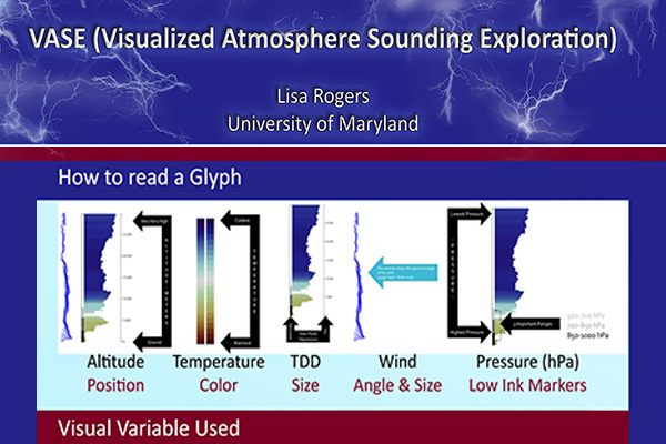
For the visualizations I created a glyph to represent sounding data, to facilitate comparing weather readings. I worked with 2 meteorologists, and showed them various stages of the prototype for usability feedback. While reading the sounding data is much easier using this measure, feedback from non meteorologists show that you still need to be trained in the science of weather to glean meaningful data from the data set.
Weather data for this project was obtained from the University of Wyoming’s Department of Atmospheric Science.
The full poster can be found below, as well as links to the full paper in pdf form (the official conference one had a 2 page limit). If you’d like to read the source code for the visualizations, send me an email at lmrogers@umd.edu.


Leave a comment